By Stephanie Weaver
I was able to get over to the Autry Museum of Western Heritage to see their newest exhibition called Home Lands: How Women Made the West. It's truly one of THE most creative and engaging exhibits I've ever seen, so I wanted to do it justice with a full blog post and some research. The show ran at the Autry through August 22, 2010 in Los Angeles, and will travel to other venues afterwards (see below for locations and dates).
I've got some details on the exhibit development process from designer Tim McNeil and curator Carolyn Brucken later in this post.
When you walk in, the first thing you notice is the unusual use of materials, which goes throughout the show. It was this surprise, whimsy, and creativity that drew me in completely. I read more labels in that show than I have in years (I tend to skim a lot).
I also loved how they put the labels in unexpected places, using unexpected materials, like burning the text into wood and stitching the label by hand onto jute strapping.
They did an exceptional job of finding individual stories that were totally rich, and using them to bring each of the three sections to life.
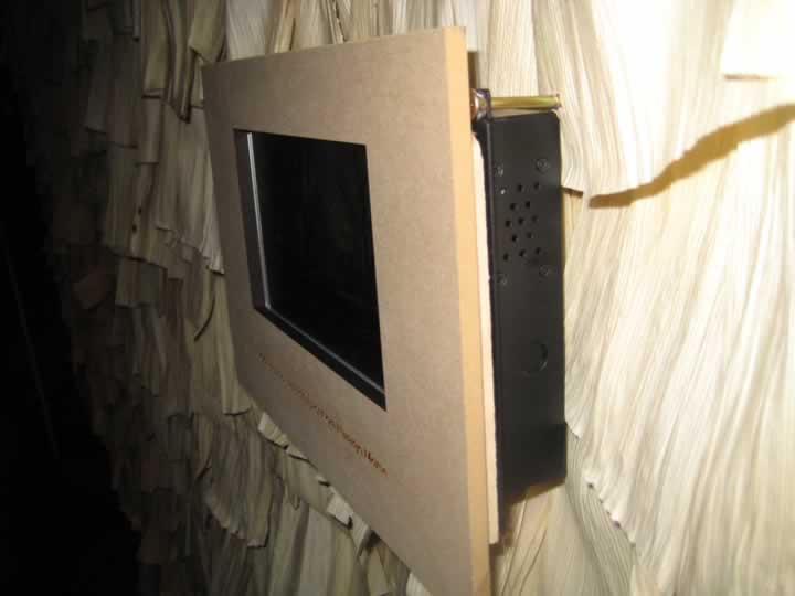
The A/V components were woven in beautifully... video projected onto a burlap wall, old-style telephones gave you interview clips with the first black doctor in Colorado.
Last, I loved how each section had a different look, and they created little pods or vignettes to showcase different women. This section on women authors had first editions mounted in the "wall" with audio clips of the books on the old-timey telephone components. The hanging booklet lists all the books on the wall.
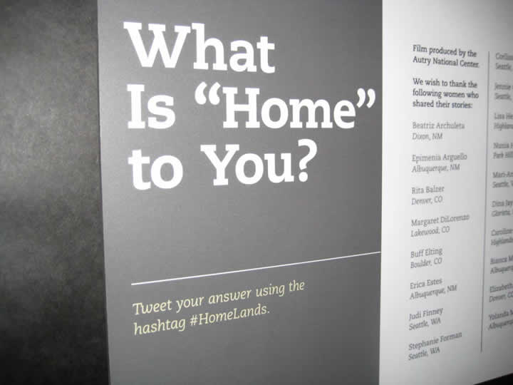
I also loved that they added a social media component as a talkback feature.
Here's some background on the design approach from Tim McNeil:
The exhibition was destined to be an interesting one right from the outset since the synergy between the Autry curatorial team and design team was excellent. We had such a blast designing this one. Every exhibit and idea is different with a huge amount of background research and experimentation. We attempted to push the "history exhibition" in some new directions, principally using compelling visitor experiences and a consistently high level of design details to wrap an engaging narrative around a rather eclectic group of diverse objects. A range of objects, people and stories that collectively illustrate a fascinating new take on the West.
Some of the design objectives were:
- Highly collaborative curatorial process
- Expressive design approach—everything has meaning
- Design becomes symbolic of stories and ideas
- Variety of content access points
- Mix of media and communication approaches
- High degree of material exploration and construction—domestic in feel
- Deliberately low-tech on the exterior—invisible media
- Travel to multiple venues
- Keep within a limited budget
Exhibition Team:
Curators: Carolyn Brucken and Viginia Scharff
Design and Interpretive Approach: Muniz/McNeil Design
Exhibition Installation and Fabrication: Autry inhouse team, Cinnabar, Ironwood Scenic
Media Production: Autry inhouse team and Kristy Baltezore
And from the curatorial side, Carolyn Brucken, PhD who is the Associate Curator for Western Women's History at the Autry:
1. The development process was over six years and included the exhibition, the Home Lands companion book, and a teachers' curriculum developed in collaboration with the National Center for History in the Schools.
2. Regarding our process, collaborations were at the heart of the exhibition. The exhibition originated from the merger of the Women of the West Museum in Boulder with the Autry National Center in Los Angeles and from the very beginning I worked closely with Virginia Scharff, Professor of History at the University of New Mexico and Chair of Women of the West at the Autry, to create the exhibition. The exhibition benefited hugely from the open collaboration of Virginia and myself with our designers Tim McNeil and Christopher Muniz. We also brought in three scholars as advisors very early in the process in 2005 and worked closely with the National Center for History in the Schools and teachers in Colorado, Oregon, New Mexico, and California for much of the project as well.
3. Related to content, our desire was to make discovery central to the exhibition content. Virginia, Tim, Christopher and myself spent a great deal of time discussing how to present artifacts and complex ideas in ways that engaged directly with the visitors. It was amazing to work with such a smart group of people and build something together.
3. We knew we wanted to create an exhibition narrative that encompassed the diversity of women across different historical periods and across different cultures as we felt that many exhibitions tend to compartmentalize women's history. The challenge was finding ways to hold the different stories and moments in time together, especially in the exhibition text. In part, we selected a specific resource for each of the three sections to serve hopefully as a connecting thread, as well as ground the exhibition in specific environments and places.
4. I'm proud that the exhibition team as well as the Autry was willing to take risks on this show, and to try new ways of engaging our public without compromising on the scholarship or complexity of the story we were trying to tell.
Kudos to everyone involved on this amazing visitor experience! Do try to see it as it travels:
- Missouri History Museum, St. Louis—Oct. 15, 2012-Jan.15, 2011
- The Gilcrease Museum, Tulsa, Oklahoma—Feb. 2011-May 2011
- The Palace of Governors, New Mexico History Museum, Santa Fe—June 2011-Sept. 2011.
They are open to considering an additional fall 2011 venue. Any interested institution can contact Carolyn for additional information: cbrucken [at] theautry.org.


Comments
Great article. I also like seeing James' comment about OMCA's team. I am inspired by the Autry's design objectives -- in particular, the highly collaborative curatorial process, and staying within a limited budget. Knowing more about their process and why it was so effective would be a wonderful follow-up topic -- in his words they had a "blast." I think it would be timely to learn from teams like this one in a "Covey" like approach that details the individual and group elements that make a team effective, creative, and purposeful. Can't wait to see the exhibit!
great post, Stephanie...reminds me of the new OMCA install..and I think Louise Pubols, now at Oakland, was at the Autry and mighta been part of this "team" along the way in developing this show...nonetheless the same thinking informs the new galleries at the Oakland Museum of California:
http://www.flickr.com/photos/jamesgleventhal/4747265633/in/set-721576242...
Add new comment