By WMA Staff
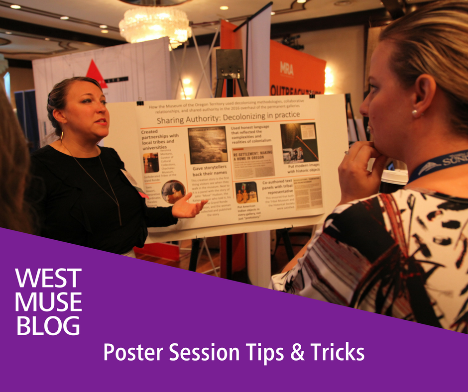
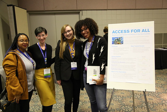
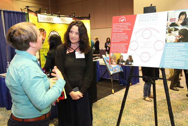
Are you submitting a Poster for WMA 2019? Fantastic! Whether you are a Poster Session pro or this is your first time designing and exhibiting a poster, we at WMA would like to provide you with a variety of tips and tricks on how to make a successful poster, how to present, and how to get the most out of your Poster Session!
WMA 2019 Poster Session Information
Poster Design & Layout
When it comes to your poster, you are the sole narrator and it is up to you to make sure the content and design are both relevant and exciting! Think of your poster as a fun, visual tool to present your research or project to session attendees, and one that generates engaging discussions. Once your proposal has been accepted, you will be given further guidelines for poster content, format, and delivery of materials.
When it comes to poster design, typically the use of imagery and colors are more attractive and engaging than leaning towards heavy text and black and white. Posters will naturally adopt a variety of layouts depending on your content, and there are even thousands of templates online. Click here for just a few ideas but feel free to explore!
When it comes to the overall layout and design, there are 5 key elements that make a GREAT poster:
-
Catchy title!
-
As poster sessions are an informal standing process, you want to draw in as many passerby as you can with a strong attention getter whether it be a title, phrase, or question.
-
-
Cohesive layout
-
Your content smoothly moves the reader left-to-right and/or top-to-bottom, with a clear beginning, middle, and end.
-
-
Stong, clear font choices
-
Use one-three basic font styles, and a font size that will be readable at a distance up to 5 feet. Your font color should easily stand out against the background whether it is light or vibrantly colored.
-
-
Visuals!
-
Images, photos, graphs, or charts are important in supporting your argument and drawing people in, but if you don't use your own images, be sure to provide the source of any image that is not yours, and only use images in the public domain.
-
-
Keep it simple and fun!
-
Your text and visuals together should allow your audience to be able to quickly absorb your main argument in just a few minutes. The less time your audience spends reading your poster, the more time you have to engage with them and make it a fun conversation.
-
Overall, the form of your poster will depend on the information you want to convey, and no matter what it looks like, your poster should be designed with CLARITY. In this process, we encourage you to think of an appealing display that will attract people, engage your audience, and generate questions or conversations.

Although most posters are designed with Microsoft PowerPoint, some can achieve better results using Microsoft Publisher, Adobe InDesign, Adobe Illustrator, and Canva's free poster creation tool found here.
Review previous year's posters in WMA's Multimedia Forum: here, here, here, here, and here.
Printing and Preparation
Whatever software program you decide, make sure to work on a large enough scale where any graphics and text won’t be pixelated (fuzzy) when printed in a large poster format. Save your final work as a PDF and send it off to your local poster printing service (Office Max, Staples, Kinko’s etc.).
Presenting
When it comes to presenting, we offer 5 tips for success:
-
It's cliché but practice makes perfect!
-
Rehearse your speil, know your key points and prepare for expected and difficult questions.
-
-
Be welcoming and dress to impress!
-
Although you don't need to wear a suit, be sure to dress smart to show that you mean business. Stand to the side of your poster, smile, and say "hello." Welcome those who look interested in your work to read more and ask them if they would like you to talk them through it.
-
-
Know your "Elevator Pitch"
-
Have a short, attention-grabbing speil of your research prepared, no more than 3 sentences and under 2 minutes.
-
-
Create a cohesive narrative
-
Just lilke the layout of your poster, your presentation should have a beginning, middle and end. As the narrotor keep it basic so everyone can understand, keep it cohesive so everyone can follow along, and keep it exciting!
-
-
Welcome feedback and disscussion
-
Generally people have a desire to learn more and can offer fresh perspectives, even something you haven't considered yet. Therefore, be open for discussion, take someone's critism as a genuine desire to understand why you've done something so they can fully interpret your research, and ask for clarification if needed.
-
For more tips on how to present, click here.
Handouts

Handouts offer something for attendees to take away, to remember you by, and are a way for your audience to get in contact with you. The Poster Session is a structured and informal way to network with museum professionals who are genuinely interested in your work and maybe share your same passion, so be sure to exchange business cards and follow up!
Additional Information
Read some advice for framing your story from Chris Anderson, the Curator of TED Conferences.
View the University of North Carolina's comprehensive resource guide to creating poster presentations.
Beyond this year, use your poster as a stepping-stone to a session proposal for WMA 2020! Keep the conversation going! Please let us know if you have any questions or comments below.
We’re looking forward to seeing you at the 2019 Poster Session!
Sources:
https://colinpurrington.com/tips/poster-design
https://guides.nyu.edu/posters
https://hacklibraryschool.com/2013/12/02/poster-sessions-a-beginners-guide/
https://www.scientifica.uk.com/neurowire/tips-for-presenting-your-scientific-poster-at-a-conference


Add new comment