By Sarah Seiter
This year, we at the Oakland Museum of California were honored to win the WMA Charles Redd Award for our exhibition, Altered State: Marijuana in California. This award was an exciting step for us, because OMCA deals with state and local issues, and the 2016 WMA annual meeting was a chance to see how other museums are tackling similar issues in their communities. I felt fortunate to attend and was particularly excited about the sessions on community curation, creating exhibitions on foster and homeless youth, and tackling institutional racism. The conversations I had at coffee breaks and between sessions were every bit as helpful as the sessions. I felt like a kid in a candy store!
I gave a presentation on our work in community prototyping and heard about other organizations that are using similar exhibition development processes. Following is a summary of my talk.
What is prototyping?
Merriam-Webster defines a prototype as “an original or first model of something from which other forms are copied or developed.” Some institutions prototype by building scale models of interactives and testing them for usability. Other organizations use front-end evaluation, where visitors and exhibition developers draw on the walls and engage in dialogue. For Altered State, we were lucky to have several weeks and a dedicated prototyping space to use whatever techniques we needed. In all, we had close to 40 hours of prototyping with our visitors, so we were able to test different techniques when we needed them. We collected feedback from the public at our Friday night events and on our “Pay-What-You-Can” Sundays, when attendance is its largest and most diverse. I’ll walk you through a few examples of our prototyping for Altered State.
Directly testing an interactive: On several occasions, someone on the team had an idea for an interactive that we could put on the floor and test immediately. These prototypes were very straightforward; we built a working model of the interactive and then tested it with our visitors to identify pain points or problems with the experience.
An example of this was the Cannabis Confessional. In our development meetings, we grappled with how to share the complex and ambivalent feelings that our visitors had about marijuana. In interviews, visitors would say things like, “I support legalization, but it bothers me how much my girlfriend smokes.” or, “I smoke marijuana so I can deal with my stressful marriage. I’m not sure if that’s good or not.” We spent hours working on how to show the internal tension that our visitors felt.
Eventually, one of our developers—in a flash of inspiration—came up with the Cannabis Confessional: a cardboard box and some notecards with the prompt, “What would you say about marijuana if you knew you’d remain anonymous?” The confessional was a huge success. No label we might have written could have captured our visitors’ complex feelings. The confessional made it easy for visitors to share their feelings anonymously and provided us with incredibly honest content. Once we knew that the interactive worked, the rest of the design process was straightforward. We were mostly interested in making the confessional easy to use and maintain.
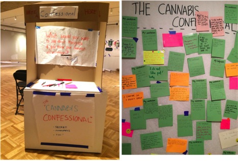
The confessional being tested
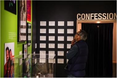
The finished confessional in the exhibit
Learning what content and experience visitors respond to: At other times in the process, we didn’t have a clearly defined interactive ready to test, and we were struggling with how to best present the content. In these cases, prototyping helped us see what aspects of the content or experience would appeal most to visitors.
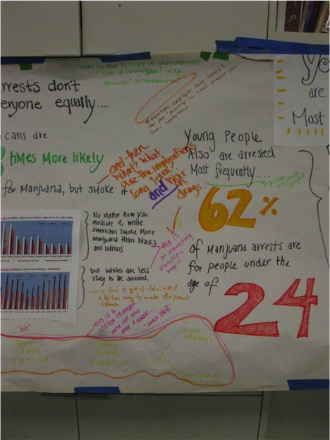
An example of this was our Criminal Dope section. We intended to present information on arrest rates for marijuana, especially the racial disparities in those rates. However, some of our team members felt that visitors would be turned off if we presented the actual arrest statistics. They were concerned that people might not relate to a data-heavy presentation and might feel left out or intimidated.
As a preliminary step, we put up a hand-lettered infographic on arrest rates, hoping simply to generate conversation with visitors. What happened next surprised us. Instead of being turned off by the numbers, visitors were actually engaged with them. They began to point at the graphic and discuss the trends. One man used his phone to share the statistics with a friend at home. Another woman meticulously texted a picture of every statistic to her boyfriend.
Although this part of the prototyping process didn’t directly inspire an interactive, it showed us that visitors weren’t afraid of complex data and gave us confidence that we could tell a complicated story about arrests using numbers, without losing the interest of our visitors.
Planning for unexpected needs: Finally, prototyping helped us identify visitor needs and desires.
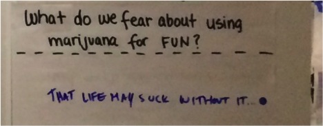
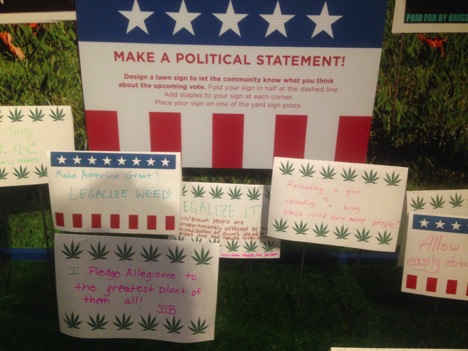
Prototyping showed us that visitors seemed to want to write slogans and jokes and to draw marijuana icons. Even with our carefully written prompts, some visitors seemed to just want to write some variation on Snoop Dogg's famous lyric, “smoke weed e’rry day.”
No visitors told us directly, “I just really want a place to write rap lyrics and slogans.” But, after spending a month in the prototyping space, it was clear that was just what they wanted. Rather than blocking this impulse, we wanted to channel the bumper sticker-level discourse into a productive conversation and to distinguish it from our more serious and intimate interactives.
Thus, the lawn sign interactive was born—visitors created a lawn sign where we encouraged sloganeering and one-liners.
Have you tried prototyping?
What were the results? Will you try it in your next exhibition? Let us know what you think!
Sarah Seiter is the Associate Curator of Natural Sciences at the Oakland Museum of California.


Add new comment