By Miriam Works
A first glance at the Western Museums Association 2013 Annual Meeting Program
If you’re looking for a proven avenue to earn revenue while engaging and educating visitors, look no further than your museum store. A well operated store that is thoughtfully designed and laid out and stocked with skillfully displayed, mission related merchandise is a valuable tool for deepening visitor connections while earning revenue for your museum.
A successful museum store operates according to consistent daily policies and procedures and established retail business practices. The successful store stocks a selection of mission appropriate merchandise that helps connect visitors more deeply to changing exhibits and the permanent collection. However, despite good operational practices and great products, stores sometimes struggle with the principles of design, layout and display. To help with these issues, Andrew Andoniadis, of Andoniadis Retail Services and Miriam Works, of Works Consulting will present “Maximize Your Earned Income: Best Practices in Museum Store Design, Layout and Display” in Salt Lake City in October 2013. Here’s a preview of just three of the display tips to be explored during their pre-conference session.
 Avoid “option paralysis” through organized displays and well-edited product lines. It’s important to present full, lush displays and have plenty of your best selling products available for easy purchase. However it is critically important to strike a balance between well-stocked and overcrowded shelves. Museum visitors lead busy lives and deal with information overload every day. If they have already viewed museum exhibits before they enter the store they are likely to be feeling visually overloaded as well. Over stuffed shelves, disorganized displays and too many choices between similar products lead to “option paralysis” i.e. frustration and indecision. The moment a visitor becomes confused or indecisive, shopping becomes frustrating. They often give up and walk away without making a purchase in your store. The solution? Well edited product lines in tightly organized displays that are constantly maintained through dusting, rearranging and restocking.
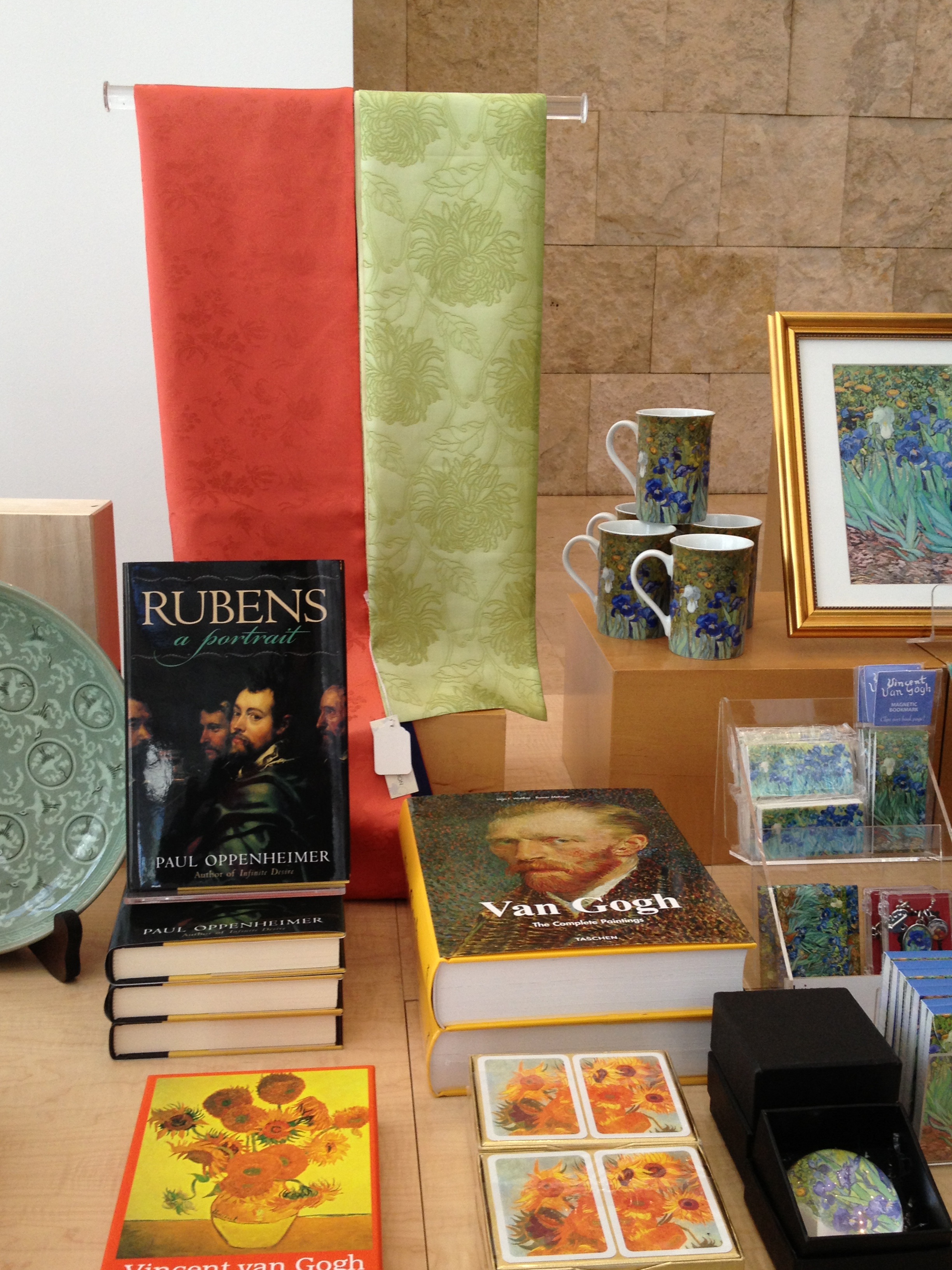
- Displays must be touchable but also “shoppable.” Harvard Business School research indicates that customers are more likely to buy if they can touch the product first. Touching and handling creates symbolic connections between people and products. Physically holding products creates a sense of psychological ownership, driving must-have purchase decisions. When a shopper reaches into a display, they should be able to easily remove an object to handle it without worrying that they will knock over or disrupt other products. To get lots of product into a small space, while keeping them organized and shoppable, use risers or covered boxes of various sizes with the tallest towards the back and smaller ones towards the front, like a staircase. Usually the tallest items look best on the tallest risers, but always be sure each item is stable, accessible – and shoppable – on its riser. There are a few exceptions to this guideline. For example very fragile products must be displayed in a way that discourages frequent handling. Signage should gently urge shoppers to ask for help before handling highly breakable products.
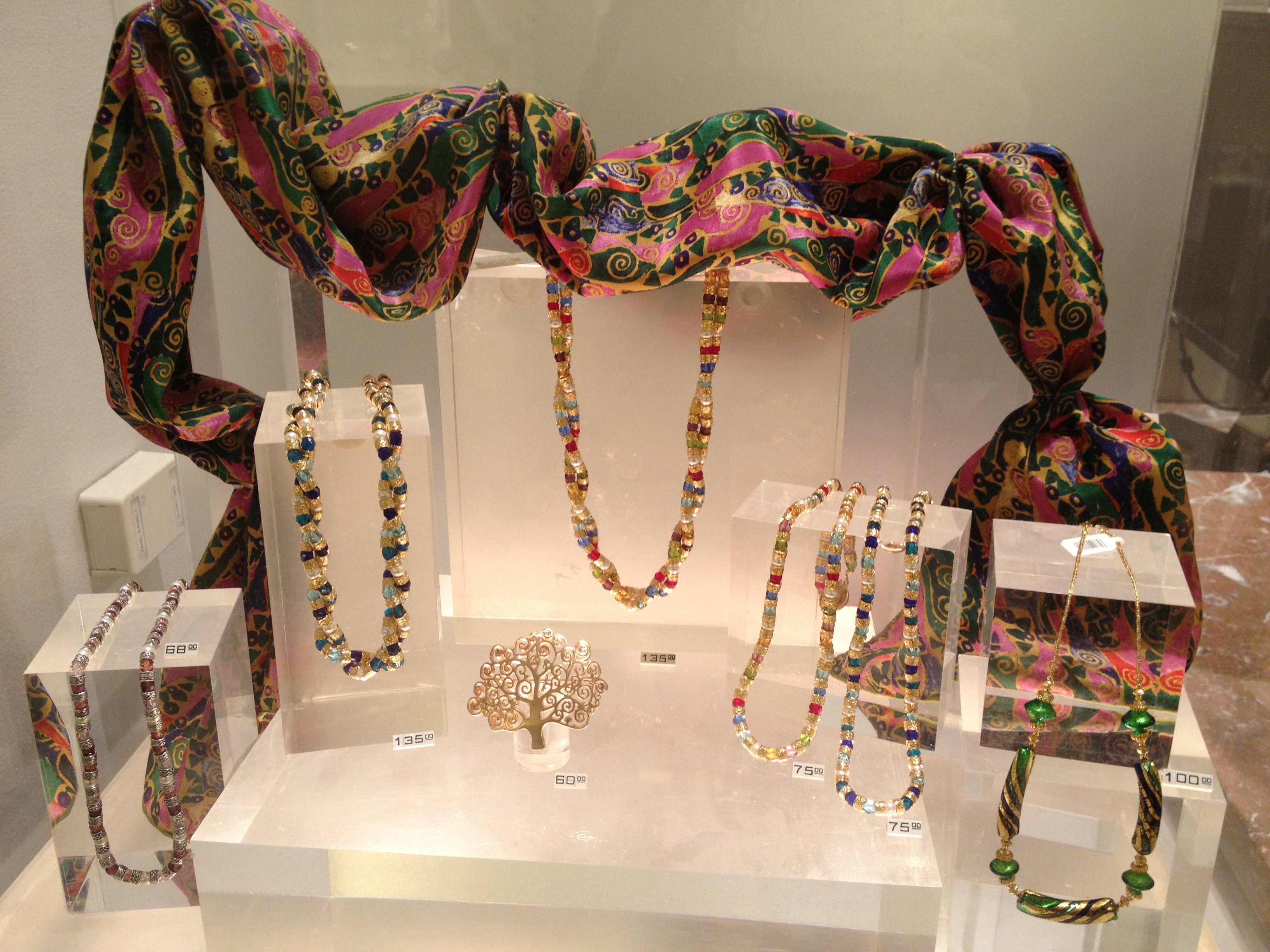
 Make prices obvious. No one likes to have to ask for a price. Many customers are reluctant to request assistance from the salesperson if they want to browse before deciding to buy. The customer may not want to bother the salesperson, or may be trying to avoid what they most fear: an unwelcome sales pitch. Some museum stores have a reputation for showing expensive merchandise, even if only a small selection of products is higher end. This may be a result of the wide spread practice of displaying prices only on jewelry or other expensive items. Or shoppers may ask for a price, hear a figure that is out of their budget and assume all other products are similarly priced. To counteract this misapprehension, be sure to include a range of prices in the store selection. Consider including signage, price cubes, readable tags, or all three, on or near products in a range of prices. Take customer service a step further by placing price tags in a consistent place on merchandise so customers learn where to look.
Help ensure your store achieves its potential by following these and many other display, design and layout strategies presented in “Maximize Your Earned Income: Best Practices in Museum Store Design, Layout and Display” Wednesday, October 9, 2013, 8:00 AM- Noon at the Hilton Salt Lake City Center.
To register for this Workshop at the 2013 Annual Meeting, please visit: http://www.regonline.com/WMA2013
Miriam Works guides museums and nonprofit organizations in designing and operating profitable retail stores that maximize revenue while providing educational and engaging visitor experiences. In close collaboration with clients, she designs compelling spaces, establishes clear operational procedures, buys top selling, mission based products and provides outstanding customer service training for staff and volunteers.


Comments
Nice... Thanks for the info
Add new comment